
Text and Graphics
Use purposeful graphics only.
Graphics that add no value to a user's understanding of a site or its content distract and frustrate the user, especially if loading takes a long time.
Avoid Cluttered, Overly Dense Displays.
Keep pages clean and uncluttered. Avoid crowding too many items on any one page. Clutter and crowding distract the user, make it hard for the user to find information, increasing user frustration.
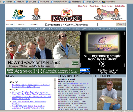
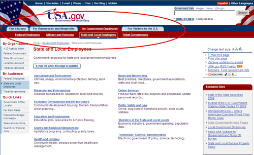
Example
This home page contains too many competing images and sections, making it difficult to determine which is most important information or where to look for different types of information.
Font Size and Style
Use familiar font styles sized at a minimum of 12 points. Familiar fonts include Times New Roman, Georgia, Arial, Helvetica or Verdana.
Text and background colors
Use dark text on plain, light-colored background for best contrast.Users read faster with pages that have dark text on light backgrounds. The higher the contrast, the easier the page is to read.
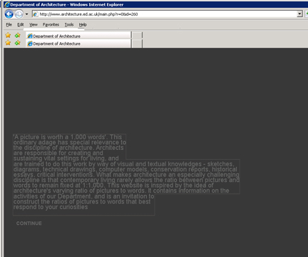
Examples
The two examples below do not provide adequate contrast between text and background.
Text Format Options
Use HTML for all documents meant to be read on the computer; use PDF only for documents intended for printing and hardcopy reading.PDF documents are difficult to read on computer screens and are not accessible to all users.
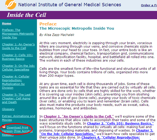
Example
This site offers a Web text version for reading online and a link (circled in red) to a .pdf version for printing.
Page Layout and Presentation
Placement
Place important items toward the top and center of the page.Users generally look first at the top center of a page, then left , then right.
Example
Web Conventions
Use familiar Web conventions for placement and appearance of major elements as follows:
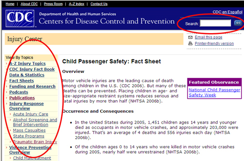
- Place primary navigation menus on the left side of the page.
- Locate the search function near the top of the page.
Following Web conventions saves the user time in navigating the site and finding information. Diverging from the standard way of doing things slows down and frustrates the user.
Example
Eliminate horizontal scrolling
Set the width of your content section proportionally rather than fixed to eliminate the need for users to scroll horizontally.
References
- Research-Based Web Design & Usability Guidelines. Version 2. Washington, DC: U.S. Department of Health and Human Services, and U.S. General Services Administration; 2004.
- Nielsen J. Designing Web Usability. Indianapolis, IN: Hew Riders Publishing; 2000.